The Opportunity
COTA SA is the peak body representing the rights, interests and future of SA’s over 50s. They are at the forefront with their social enterprise, The Plug-in, working with businesses, government and not-for-profit sectors to innovate to improve their products, services and policies for the growing market.
In 2017, COTA SA required a brand strategy and identity for The Plug-in. It needed to visually express older South Australians’ willingness and eagerness to be ‘plugged in’ to research and innovation about technology, services and products that support ageing well.
The brand identity and language needed to be fresh, creative, dynamic, responsive and reliable. It was also important for the audience to feel important, welcome, valued, respected, supported, connected, heard and empowered.
Our Approach
We started by conducting a brand workshop where we profiled:
- The key stakeholders and their needs
- The brand personality
- The tagline and positioning
This resulted in the development of a ‘brand blueprint’, which provided clarity on the brand positioning and informed the design brief.
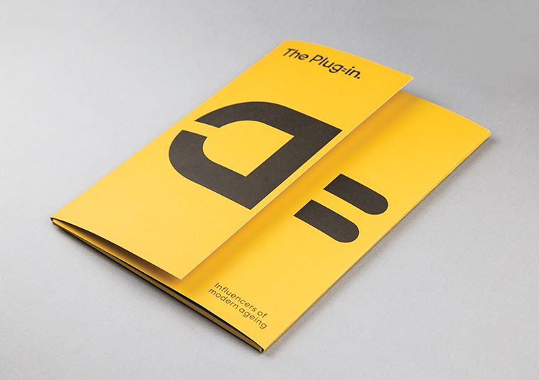
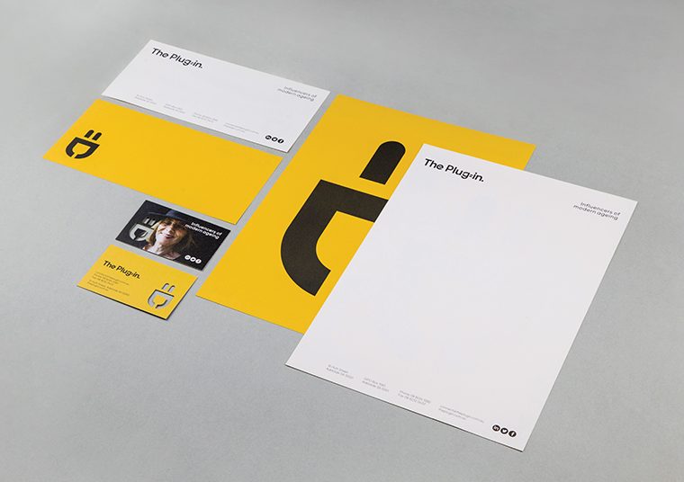
We felt strongly the brand identity needed to speak to its name and in researching the core elements, they needed to earn their place in the final logo mark with a story and meaning for each.
The main elements represented in the logo include:
- A plug
- An on button
- People
- Equals
- A smiley face
The friendliness and warmth of the brand shines through with the playful incorporation of a smiley face also visible in the ‘g’ and equals symbol.
communikate et al conceptualised and managed the following project elements:
- Photoshoot
- Explainer animation
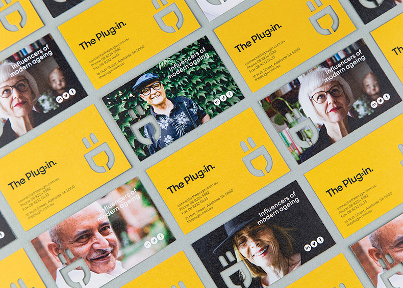
- Corporate stationery
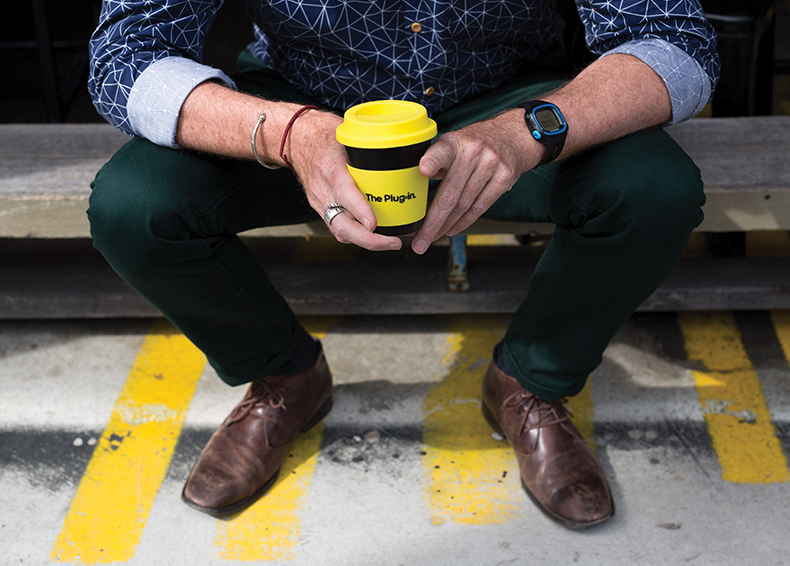
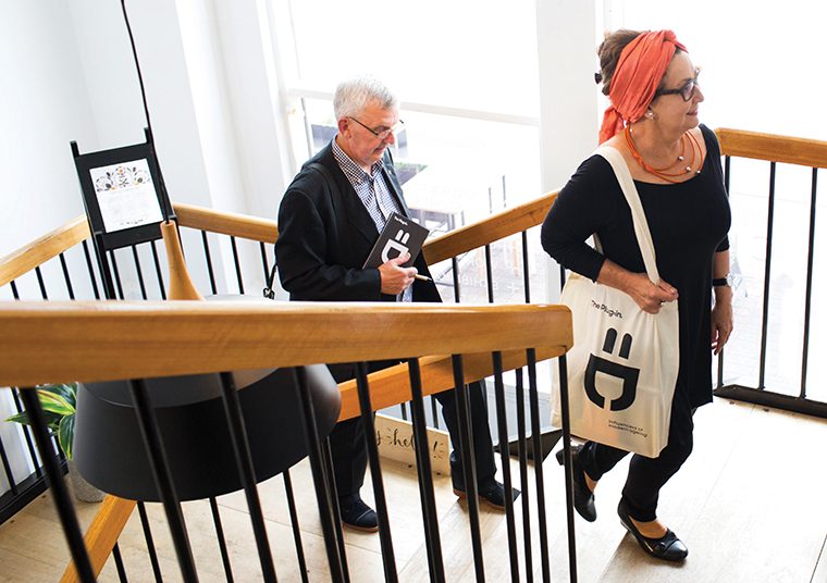
- Merchandise
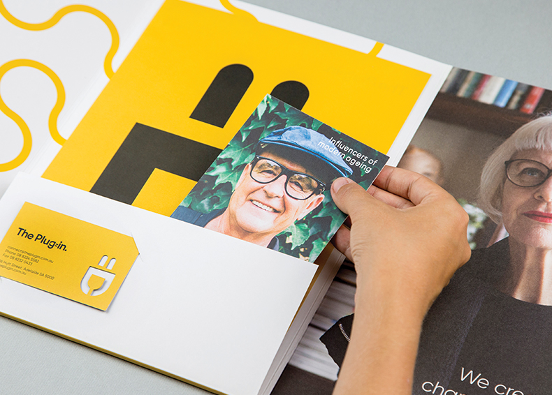
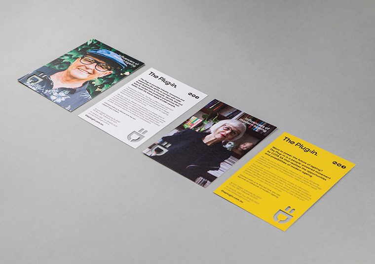
- Collateral including postcards, brochures
- Exhibition displays
- Slide deck, proposal and report templates
- Advertising and invitation templates
- Digital content (EDM, social media)
The Outcome
The Plug-in has steadily grown since 2017, now with 26 projects completed for 19 clients including Weber, ACH Group, CSIRO and University of Adelaide.
Striking a balance between playfulness and meaning was fundamental to the success of the identity. So too was:
- The ability to separate the plug/smiley face mark, making the brand exceptionally dynamic in its application
- The addition of a carefully curated selection of photographs keeping the identity fresh and engaging
- The plug being animated, bringing the dynamic brand identity to life
The punchy colour palette:
- Speaks to innovation and idea generation
- Creates interest
- Grabs the viewers’ attention
- Is fun, bright and stimulates a sense of joy
Leading on the right foot from the beginning, with a highly considered, professional and impactful brand helped COTA SA and The Plug-in to create clarity in the market quickly.
